Graphic Design & Print


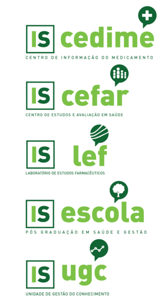
Here, you can see the redesign proposals for the logo of each team, or department, under the business unit InfoSaúde - Cedime, Cefar, LEF, Escola, and UGC, each with its own field of action under the umbrella of information on Health.
The logo proposals are composed by the abbreviated form of the InfoSaúde logo to the left, to give the idea of it being part of a business unit and not a self-standing business; the abbreviated, or full name, when appropriate, to the right as well as the iconography of the department and its field of action.
And underneath, the non-abbreviated form of the department name.
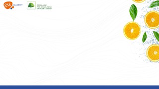
At ANF, we mediated and promoted a number of seminars given to pharmacists and technicians by the industry stakeholders. But since some happened during the pandemic, we promoted those webinars and were responsible for mediating them on videocall platforms, such as Zoom.
I was responsible for creating posters and backgrounds for some of those webinars, pictured here the one done in partnership with GSK.
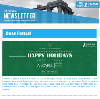
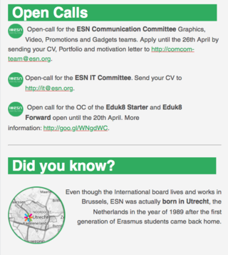
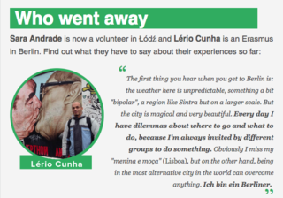
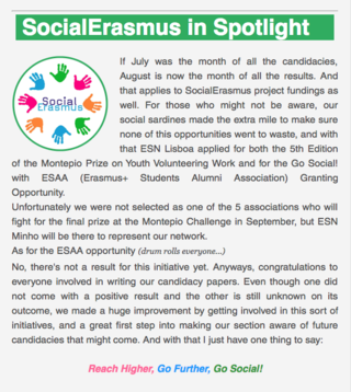
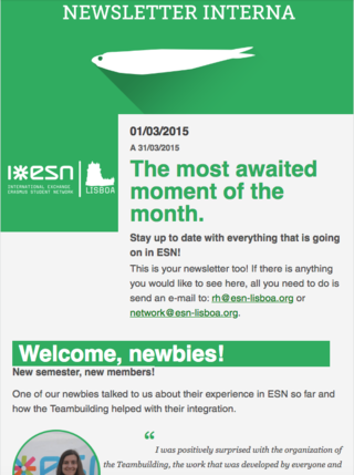
Later on, as the Communication Manager of ESN Portugal, I was responsible for coordinating with the Committee members who designed and edited the Newsletter.
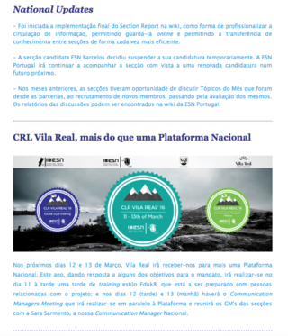
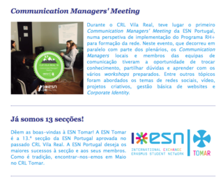
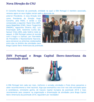
We gave updates about events, highlighted ESN sections in the country and their events, wrote about our partner institutions and other stakeholders, shared open calls, and when we finally had the awaited Communication Managers' Meeting, a pilot event called under the education for local sections we tried to implement during our madate, called PTnt, we informed the local sections as well.
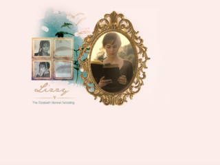
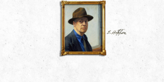
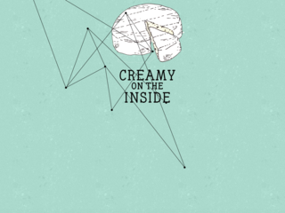
The way I got interested in web and graphic design was in trying to create my own blog and website headers. First with Paint Shop Pro, back in the day. And then with Adobe Photoshop.
On the left, there are a few examples of some of my personal favourites, which all happen to belong to a series of header designs I've made for websites listed under the Fanlistings.Org directory. Its subjects range from painters, to cheese, literary characters and a music album.
As a member of the Communication Team of ESN Lisboa, I was the responsible person for desnigning, formatting and editing the content of the monthly Newsletters. I created some dynamic with testemonials, interviews, open calls, events, and so on.
Website developed during the Coding workshop SheCodes, where I've developed basic skills in HTML, CSS and JavaScript.
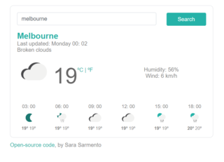
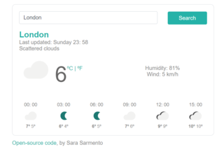
The following web app was developed using VSCode and Github, built in HTML, CSS, Javascript, using a Bootstrap framework and the Open Weather API. Hosting is provided for free by Netlify.
You can search for the weather in a specific city...
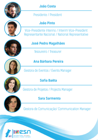
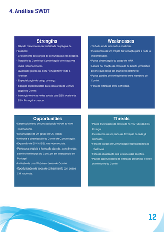
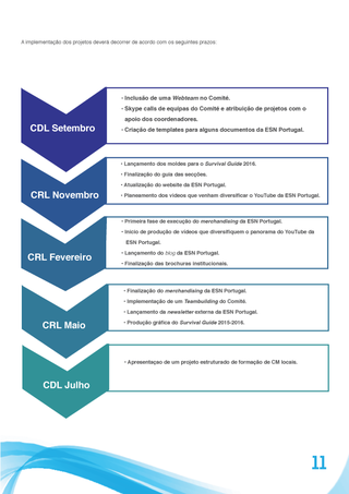
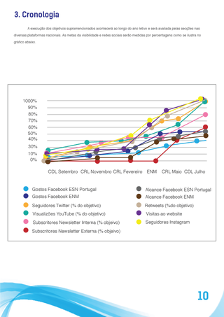
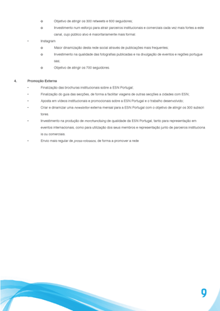
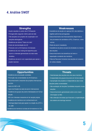
PAO (Plano de Atividades e Orçamento, or the Activities and Budget Plan), was a document I designed and edited, but which content was a contribution of the whole board. We set up goals for the year in all areas, made a SWOT analysis of the network and detected strong points and opportunities to grow, and we did the same for each field represented (included here the one for our national Communication and the plan of action I had created for it).
I've worked on a few icon collections on my free time, some of it to use in designs, some of it as freebies or downloadable pieces. The entire collection can been seen on The Noun Project.
As a member of the Video Team of the Communication Committee of ESN AISBL, I've created the logo of ESNnews, a video segment with updates about the network.
I made a few proposals you can see on the left. The inspiration was the classic news graphics on TV, using the most sober colours of the ESN palette.
And here is the chosen logo applied to the ESNnews intro animation, made in After Effects.
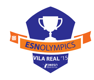
During my time as national Communication Manager of ESN Portugal, I was tasked with creating a new logo for the national sports event, ESNolympics. Thus, a badge was implemented with the name of the event and the symbol of competition - a cup. Below is the city where it will take place and the year, both of which will change each year.
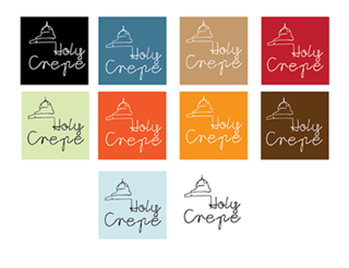
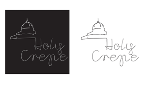
Logo created in 2012 for the kiosk Holy Crepe, which is dedicated to selling crêpes. It was asked for us to include an element of the typical Lisbon kiosks, having decided for a simple line work and a font which would give some continuity to the cupola.
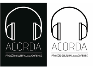
While I was still in University, a friend asked me to create a logo for his cultural project in our city, called Acorda. The aim was to promote art in general, but focused very highly on music.
So all I did was create this very simple design with a pair of headphones and the name of the project.
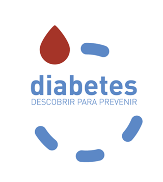
While I worked at ANF - Associação Nacional das Farmácias, I was asked to create a logo for a project about Diabetes prevention. The result is a dashed circle indicating the movement of the fingertip, ending in a blood drop - the first steps for the awareness and prevention.
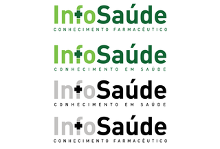
We were asked to design some proposals for new Logotypes for the InfoSaúde (a business unit inserted in the ANF group) that included our team.
To the left, there are a number of slight re-designs to the original logo.
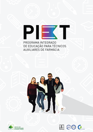
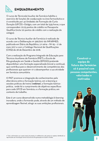
This is the logo I have created for the Pharmacy technicians' Training Programme, PIET, a programme that allied itself with FIT (dedicated to Pharmacists), which Booklet you can see here.
Logo developed for a personal online project which consisted of sharing visual work from creators around the world.
The concept developed from a series of octagonal shapes, which interloped, creating a "collage" of sorts.
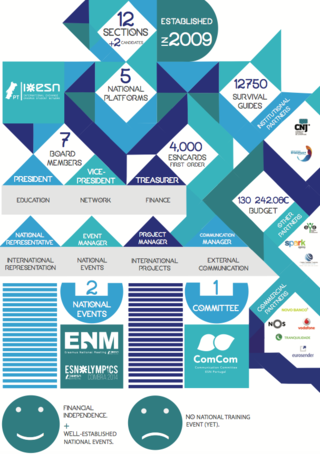
This poster was designed as a way to highlight the important facts about ESN Portugal during the National Boards' Meeting in 2015, in Brno, Czech Republic.
The information included number of sections, printed Survival Guides, structure of the board, mandate budget, partnerships, national events, positive points and less positive ones.
The design is made up of geometrical shapes which connect, allowing it to be read in tiers.
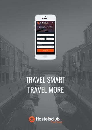
I have designed a number of posters, including this one, for HostelsClub with the intent of both sharing online and printing to place on partner Hotels and other establishments.
E-Learning Courses
Web Design & Layouts

Newsletters
Digital Assets
Print Materials
Icons
Posters
Logotypes

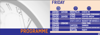
The Guide included a schedule, what to bring, a guide to the city (which changes every event, but in 2015 was in Vila Real), emergency contacts, and other useful information for participants.
The ESNOlympics Survival Guide was designed for the sports national event of ESNPortugal, which promotes a one-weekend sports competition between students from all over Europe.
This includes sports such as Volleyball, Basketball and Football, and the possibility to attend a Basket on Wheels (sports for people with disabilities) tournament.
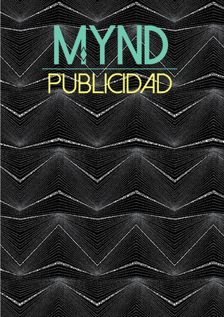
Mynd was born as an Art Direction (Dirección de Arte) class project during my Erasmus period in Spain.
For this class, we had to build the prototype of an Art Direction magazine, highlighting interesting campaigns from brands, which were selected and written about by different groups in class.
In the design, I tried to adpt the main focus of the campaigns, such as the brightnes of the stars, or the beauty of women.
The structure of this promotional booklet includes the framework of the course, the team, duration, prices, and all details.
For this campaign, we also included a number of graphics for social media, did a photoshoot for the campaign, and I produced some graphics in bright colours that evoked the ones of FIT, our main education programme's colours (green, blue, purple, and orange, each corresponding to an area of education).
We worked together to come up with the copy for these campaigns, and with the structure and written information that was given to me, I worked on the Booklet.
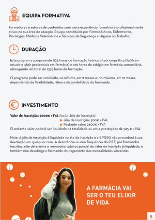
When I worked at ANF (Associação Nacional das Farmácias, the National Pharmacists' Association), I was part of the team that dedicated itself to providing educational materials and courses for pharmacists in the several fields they worked in (Technical English for Pharmacists, and so on).
A great part of my work consisted in working on the formatting, design, and interactive parts of our offer of e-learning courses on the e-learning platform, designing social media and promotional materials, logotypes (such as the one in this Booklet), posters for webinars and courses in partnership with the industry stakeholders, as well as promotional materials for courses, such as PIET, an integrated educational programme for Pharmacy Technicians.
You can flip through the Guide here.
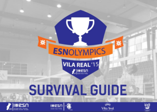
ESNOlympics Survival Guide (2015)
You can flip through the magazine below:
You can flip through the Manual below:
You can flip through the Booklet below:
MYND (2013)
ESN Portugal Survival Guide
ESN Video Visual Identity Manual
PIET Booklet
MYND
ESNOlympics Survival Guide
Posters
Logotypes
Icons
Print Materials
Digital Assets
Web Design & Layouts
Newsletters
E-Learning Courses
You can flip through the Guide here.
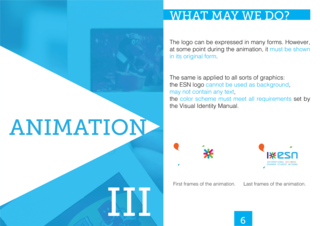
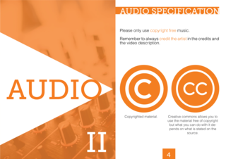
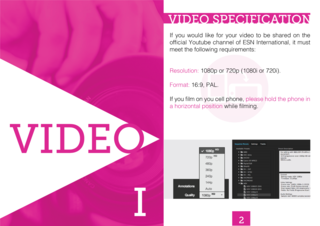
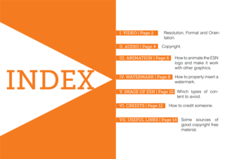
Starting out with the Index, we structured the Manual in seven different chapters, covering the majority of what goes behind the process of video editing, such as the Video itself (resolution, format and orientation), Copyright, Animation, Watermark, Image of ESN, Credits (how to insert them), and we provided useful links for free animation, music, among other resources.
The Video Visual Identity Manual was designed due to the need to provide ESN sections with a guide of best practices for video editing, in order to avoid the violation of Visual Identity, Copyright or Corporate Identity, and to make the videos more appealing and any text easy to read.
PIET Booklet (2019)
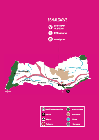
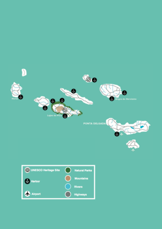
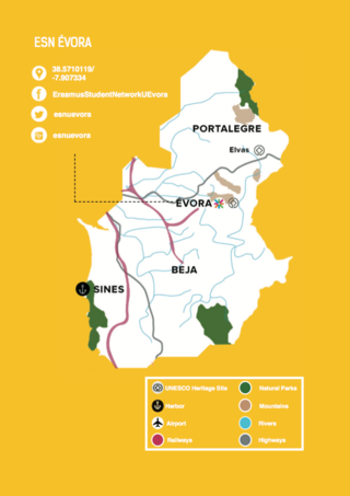
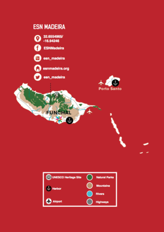
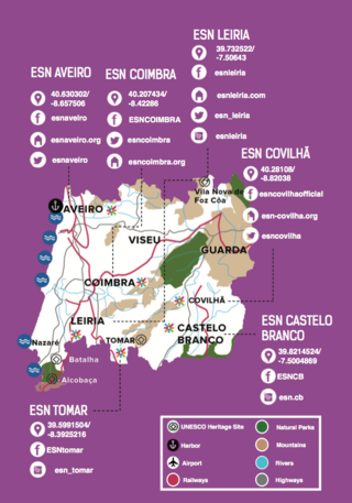
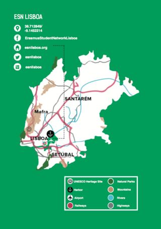
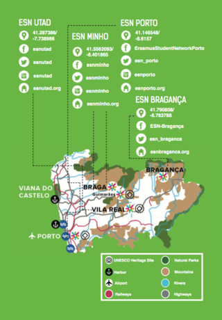
Each region then has all the information needed on where the ESN sections are located and how to contact them directly, rivers, railways, airports, national parks, UNESCO heritage sites, harbours, and mountains. These maps were also made using Adobe Illustrator.
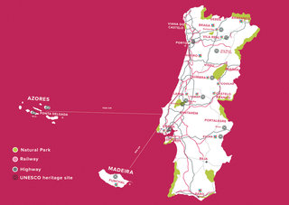
The fourth chapter has a map of the whole country, which was made from scratch using Adobe Illustrator. It includes the main national roads, railways, UNESCO heritage sites, national parks, and where ESN sections are distributed throughout the country - the labels help you navigate the map.
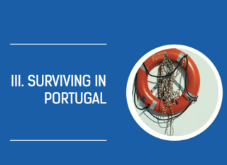
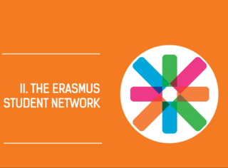
The booklet was divided into 4 chapters - Welcome to Portugal, The Erasmus Student Network, Surviving in Portugal and Discovering Portugal with ESN.
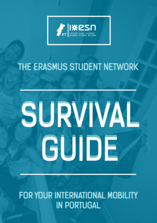
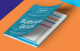
Every year, Erasmus students in Portugal receive a Survival Guide for free from the Erasmus Student Network Portugal ONG.
In 2015, I was put in charge of redesigning the whole guide in Adobe InDesign, including the cover, maps, and all images you can see below (except the logo and pictures). The idea was to make it more in line with the international Erasmus Student Network design branding, while also making it personal to the national level.
Below you'll be able to read it fully.
ESN Video Visual Identity Manual (2016)
ESN Portugal Survival Guide (2015)
JavaScript is turned off.
Please enable JavaScript to view this site properly.