Ideas
Back To List Of Works.
Ideas
BBC Accent
Campaign Video
Next Project
Competition Submission
Client: BBC
Collaboration with: justintanwy
Back To List Of Works.
Competition Submission
Client: Simple
Collaboration with: justintanwy
Campaign Video
Competition Submission
Client: Yamaha
Collaboration with: justintanwy, NicholasGoh
Simple's Musical Barsoap
The Thistory Book
Campaign Video
Previous Project
Back To List Of Works.
Previous Project
Next Project
Next Project
Back To List Of Works.
Student Project
Client: Personal
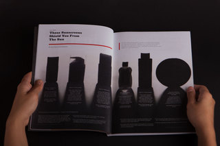
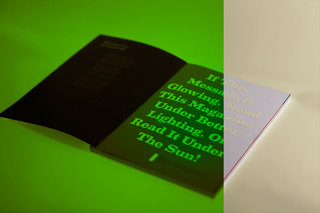
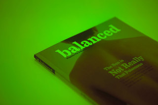
The idea for this magazine was conceived when I was browsing through the magazine section of the local bookstore and couldn't find a health magazine for the modern man. Thus, Balanced Magazine was born.
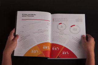
The first issue of the magazine was all about the sun, and thus included articles (complete with graphs) on how much sun was considered healthy, and travel articles to destinations with all 24 hour sun.
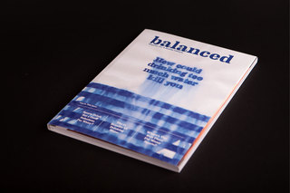
The cover for issue 2, which was about water, was also designed.

Previous Project
Back To List Of Works.
Next Project
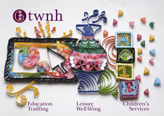
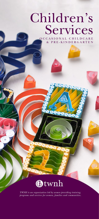
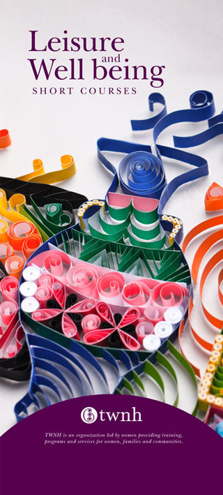
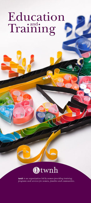
The home made and hand made aesthetic of paper quilling re-enforces the fact that the people of the house are approachable and that they service the community.
Student Project
Client: Thornbury Women's Neighborhood House
The house’s name is set entirely in lowercase, as it exudes friendliness.
The logotype uses a modified version of ITC New Baskerville – the edges have been changed to rounded corners. It was inspired by the logo’s symbol, which is made up of many curves. This makes the logo “softer”, making the brand more approachable.
A short paragraph appears below the logo detailing what the house does, on the fliers, allowing the reader to understand what twnh does and stand for without knowing what “twnh” stands for. The cover image is a paper quilling piece that contains elements of the three main branches of services that twnh offers.
Branding
twnh

Previous Project
Next Project
Back To List Of Works.
Previous Project
Next Project
Student Project
Client: The Lucas Group
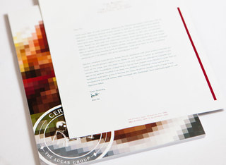
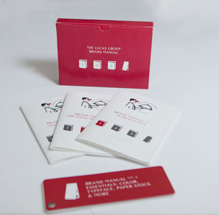
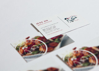
The Concept of The Lucas Group branding can be consolidated into 2 words: Food Porn. Food Porn is defined as “food photography and styling that presents
food provocatively, in a similar way to glamour photography or pornographic photography.” And pornography is often associated with censor bars and pixellated images.
However, this logo is also a statement of the company that
is moving away from fine dining and into prestige casual dining. The formal waiter, which is usually associated with fine dining, is pixelated and censored, as the waiter is serving
food that is too cutting edge and not easily accepted by the traditional crowd. Therefore, being seen as explicit, or rude.
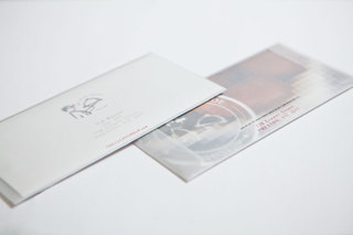
The company’s name and the tag line is set in a circle around the tray to re-enforce the message that the company’s core focus is the quality of the food they serve. The Rude-Foods tag line emphasises the fact that the food that is served is considered explicit.
The Lucas Group
Branding

I am a graphic designer from Singapore currently based in Melbourne.
After completing my diploma in Creative Media Design, I've been finding the right balance between effective, beautiful and creative.
I would love to hear from you! Check out my works and/or drop me a mail at: info.zhseow@gmail.com
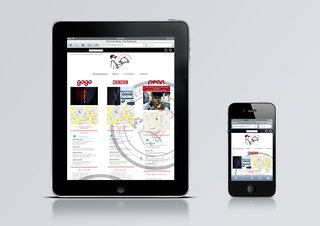
If you are visiting this site from a mobile, click on mobile on the navigation tab for a mobile friendly layout.
ZHAO
The Portfolio of
Back To List Of Works.
Selected Works
Campaign Video
BBC Accent
Campaign Video
Simple's Musical Barsoap
Campaign Video
Yamaha Thistory Book
Editorial Design
Balanced Magazine
Branding
twnh
Branding
The Lucas Group
Graphic Design
BJBall Paper Promotion

Student Project
Client: BJBall
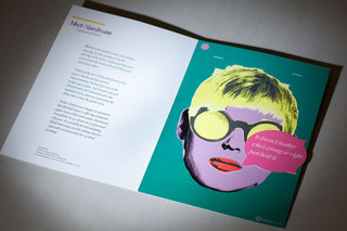
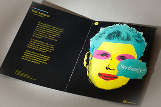
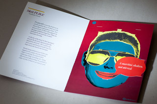
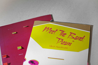
For this project, a fictional band
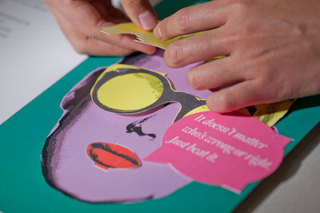
was created, with each paper stock representing a different band member. After analyzing the different papers, the personality of each band member and their role was created. Each band member was visualized in the form of a folder consisting of a small write up, and a poster of the band member’s face. The posters can be seperated from the cover.
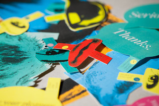
However, this isn’t the focus of the project. This project is meant for creative people, and as creative
people treasure individuality, users are encouraged to personalise the posters. Users can easily swap any facial
feature to create a new character. Each
band member also has a set of speech bubbles. Users can attach the speech bubbles to give others a hint of their mood, or write their own on the blank ones. It is not unlike a status update.
The facial features are almost life size, so users can play around with the facial features and give themselves a new look too. Especially when they are having their photographs taken.
All of the above contributes to encouraging interactions with others via paper, and with the papers themselves. And in turn, this will create memories that will remind the user of BJ Ball Paper and the various paper stocks.
Editorial Design
Balanced
Magazine
Graphic Design
BJBall Paper Promotion
JavaScript is turned off.
Please enable JavaScript to view this site properly.