Design
Balanced Magazine
Student Project
Client: Personal
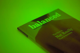
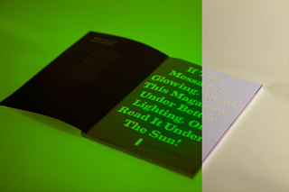
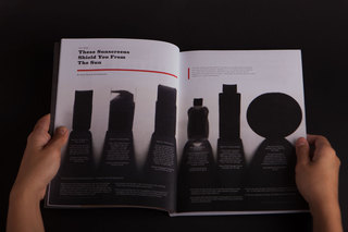
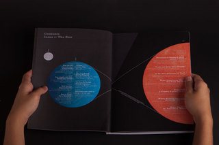
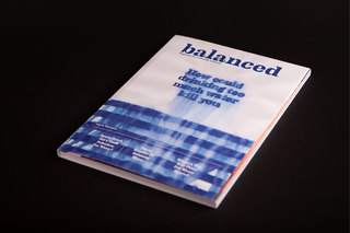
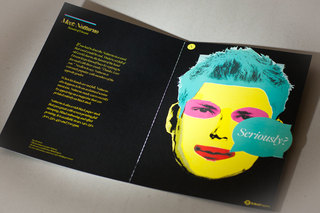
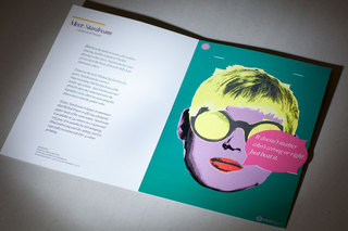
The idea for this magazine was conceived when I was browsing through the magazine section of the local bookstore and couldn't find a health magazine for the modern man. Thus, Balanced Magazine was born.
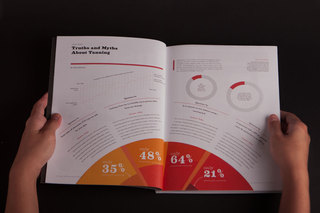
The first issue of the magazine was all about the sun, and thus included articles (complete with graphs) on how much sun was considered healthy, and travel articles to destinations with all 24 hour sun.
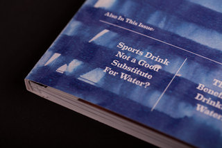
The cover for issue 2, which was about water, was also designed.
BJBall Paper Promotion
Student Project
Client: The Lucas Group
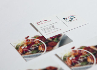
The Concept of The Lucas Group branding can be consolidated into 2 words: Food Porn. Food Porn is defined as “food photography and styling that presents
food provocatively, in a similar way to glamour photography or pornographic photography.” And pornography is often associated with censor bars and pixellated images.
However, this logo is also a statement of the company that
is moving away from fine dining and into prestige casual dining. The formal waiter, which is usually associated with fine dining, is pixelated and censored, as the waiter is serving
food that is too cutting edge and not easily accepted by the traditional crowd. Therefore, being seen as explicit, or rude.
The company’s name and the tag line is set in a circle around the tray to re-enforce the message that the company’s core focus is the quality of the food they serve. The Rude-Foods tag line emphasises the fact that the food that is served is considered explicit.
The Lucas Group
Student Project
Client: The Lucas Group
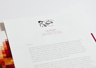
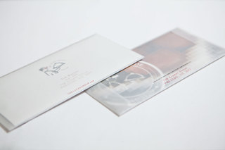
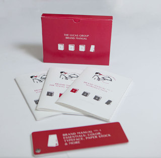
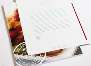
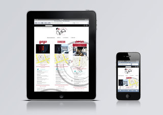
The Concept of The Lucas Group branding can be consolidated into 2 words: Food Porn. Food Porn is defined as “food photography and styling that presents
food provocatively, in a similar way to glamour photography or pornographic photography.” And pornography is often associated with censor bars and pixellated images.
However, this logo is also a statement of the company that
is moving away from fine dining and into prestige casual dining. The formal waiter, which is usually associated with fine dining, is pixelated and censored, as the waiter is serving
food that is too cutting edge and not easily accepted by the traditional crowd. Therefore, being seen as explicit, or rude.
The company’s name and the tag line is set in a circle around the tray to re-enforce the message that the company’s core focus is the quality of the food they serve. The Rude-Foods tag line emphasises the fact that the food that is served is considered explicit.
twnh
Student Project
Client: Thornbury Women's Neighborhood House
The house’s name is set entirely in lowercase, as it exudes friendliness.
The logotype uses a modified version of ITC New Baskerville – the edges have been changed to rounded corners. It was inspired by the logo’s symbol, which is made up of many curves. This makes the logo “softer”, making the brand more approachable.
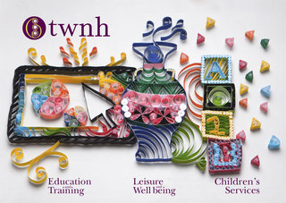
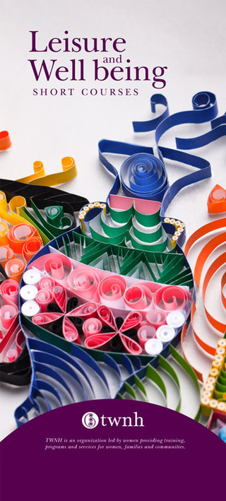
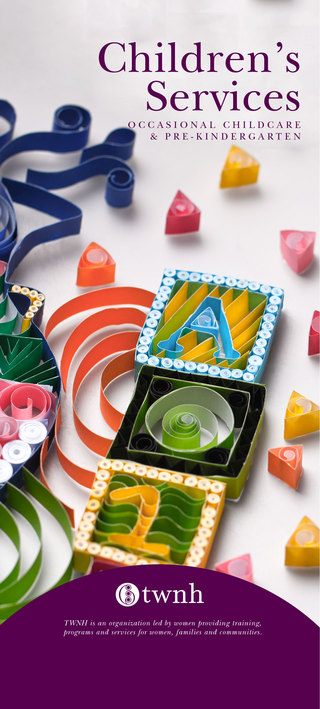
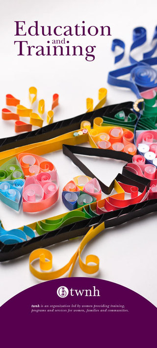
A short paragraph appears below the logo detailing what the house does, on the fliers, allowing the reader to understand what twnh does and stand for without knowing what “twnh” stands for. The cover image is a paper quilling piece that contains elements of the three main branches of services that twnh offers.

Clout Shoppe CNY
Direct Mailer
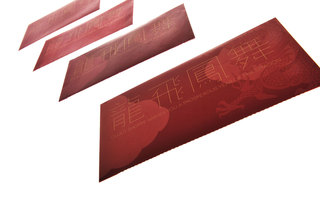
When Chinese New Year came round the corner, an online retail company required a direct mailer to communicate their special Chinese New Year offer to our customers. The direct mailer is fashioned like a red packet that elders would give to youngsters. These red packets would usually contain money, but this direct mailer contains credits that users could then use on their site.
As it was the year of the dragon, we decided to use dragon themed auspicious phases on the cover. I created a modern and minimal Chinese typeface that compliments the traditional Chinese characters.
100% Chocolate Cafe
Student Project
Editorial Design
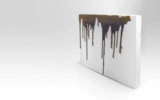
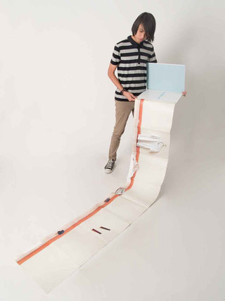
This is a coffee table book to be placed in 100% Chocolate cafe for their customers to flip through while whaling their time away on a lazy day. It has little words, just a set of pictures complete the experience of the cafe.
100% Chocolate Cafe is a cafe in central Tokyo with a very chic interior and minimalist packaging for their chocolates. Thus, I decided to let the coffee table book have a minimal approach with just one object on each page without any words. The pictures are then stitched together and printed on a very long page that can be folded out.
Forest Action Team
Student Project
Graphic Design
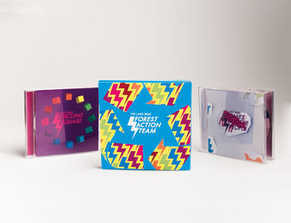
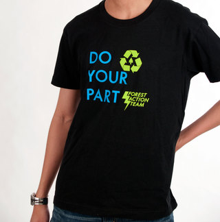
This project was done for my Polytechnic final year project . The Lard Brothers are a group of Singaporean musicians who create Electronic music. They have released an album titled Forest Action Team online free for anyone to download.
JavaScript is turned off.
Please enable JavaScript to view this site properly.