help
Mobile View
Mobile View
→ Enabling mobile optimised view
→ Expanding sandwich/burger navigation
→ Previewing your mobile site
→ Preparing and optimising your content for mobile display
→ Viewing your mobile site on a desktop browser
→ Customising your mobile view with custom CSS
Streamlined mobile display
When visiting your Salon.io site on a smartphone users will see a streamlined version of the desktop site you designed. Navigation, pages, text, images, video embeds and slideshows and have been optimised for use and legibility on smartphones.
Enabling mobile optimised view
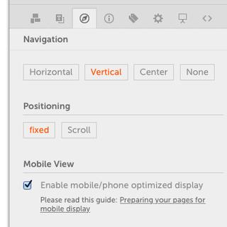
The new mobile view won’t be visible automatically to visitors of your site. You have to enable it in order to make it public. You can do this within the inspector’s navigation tab. Once the checkbox is activated all of your pages will be displayed in a mobile optimised view. This affects the navigation as well as all of your content including a swipe enabled slideshow view.
Important note: The mobile view will only be presented to your vistiors when viewed on a smartphone.
Expanding sandwich/burger navigation
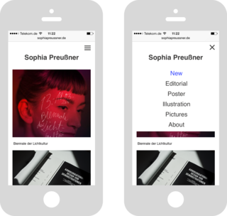
On most desktop sites, the menu is a horizontal or vertical presentation of 4-10 main categories. That typically won’t work for a thumb-friendly presentation, as the menu items would end up being way too small to be easily read or selected. So, an emerging convention has been established, and that is to collapse the entire menu structure into an icon in the header that expands on tap. Another convention has emerged around the icon itself, which now typically takes the form of a stack of three horizontal lines — known as the “sandwich” or “burger”-icon.
Your site navigation will be presented as a sandwich navigation only when you have more than 3 navigation items next to your logo/display name. If your site has less than 3 navigation items, the navigation will be displayed as a regular vertical list without a collapsing sandwich navigation.
Please note: if you choosed to hide the navigation because you have built your very own navigation using custom HTML, this cannot be translated into a sandwich navigation automatically. Please contact us for guidance.

Previewing your mobile site
If you would like to preview the mobile view of your site without making it public to everyone, you can do this by using a special preview link: On your smartphone web browser enter your site's address and attach the “?mobile=true” parameter to your URL.
See the example links on the right.
https://salon.io/username?mobile=true
http://yoursite.com/?mobile=true
Why are my contents displayed in the wrong order?
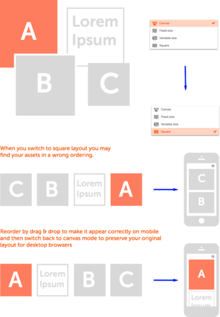
When you have pages built in canvas mode you need to take care that your content is displayed and ordered correctly on smart phones. In canvas mode the actual sequence of the assets doesn’t really matter - because every asset has an absolute position an image can be the last one in the list, but visually the first on the page. In mobile view this is different because your layouts are translated into vertical lists of text, images and videos. Now the sort order of the assets does matter.You can easily adjust the order of your assets on a page by switching to square layout temporarily. Don’t worry - you won’t loose your canvas layout. Within square mode just drag & drap your assets in the right order and switch back to canvas. Now your content will be presented correctly on smartphones.
Pages that have been built in Fixed Size, Variable Size or Square layout mode are already ordered lists and therefore they will translate perfectly into mobile view.
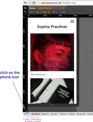
Previewing your mobile site on a desktop browser
Chrome and Opera browsers allow you to simulate the mobile display of websites on the desktop. This comes in handy when you’re optimising your site for mobile display.
In order to preview your mobile site in a desktop browser, just type in your URL and then choose from the browser menu:
View > Developer > Developer Tools (Shortcut: “ALT-CMD-I”) Then click on the phone icon in the lower left (next to the magnifier icon). Now you might need to reload your page once again for proper viewport rendering (Shortcut for reload: “CMD-R”). Now the browser renders your site as if you would see it on your phone including touch gestures.
Note that your site will only be rendered in mobile view if you did enable the option in the navigation tab. However you can still preview it when you attach the “?mobile=true” parameter to your site URL.
Customising your mobile view
with custom CSS
You may want to further customise your mobile site using css.
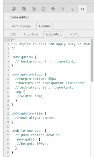
Within the global code editor you will find now three CSS tabs:
CSS
Styles in this tab apply to all devices: desktop, tablet and smartphones. This is useful for general styles like fonts and colors.
CSS-Des
CSS styles in this tab apply only to desktop and tablet view
Note: If you had already customized your site using CSS you will now find your code in this tab.
CSS-Mob
Styles in this tab apply only to mobile view, that is when your site is accessed wit a smartphone. For your convenience we have added some example selectors and css that should make it obvious how you can further customize your mobile site.
Note: none of this css code takes effect until you uncomment the code by removing the two slashes before an individual css command.
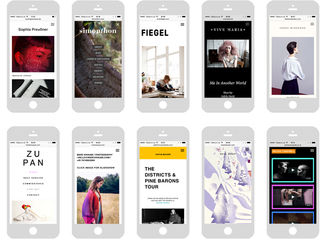
Mobile view examples
Assistance
This is the first release of the new mobile view feature, so not everything might be perfect. But thanks to the custom CSS option, it is possible to make very indivdual changes to your mobile view of your site. Please contact us when you need assistance: support@salon.io
JavaScript is turned off.
Please enable JavaScript to view this site properly.